Author Topic: Welcome to the Bold and Blocky Instagram Era of Book Covers - Vulture article  (Read 4309 times)

Tom Wood

"If books have design eras, we’re in an age of statement wallpaper and fatty text."

"Books that are designed to render well on digital screens also look great on social."

"In a marriage of irony and logic, a book that pops in a filtered miniature Instagram still life can declare its presence just as loudly from across the room, particularly in the boutique environment of the modern independent bookstore."


https://www.vulture.com/2019/01/dazzling-blocky-book-covers-designed-for-amazon-instagram.html
« Last Edit: February 05, 2019, 09:33:37 PM by Tom Wood »
 
The following users thanked this post: Bill Hiatt

Post-Crisis D

Maybe it's just me, but neither of those two covers are particularly appealing.  Plus, for all the talk of making titles stand out in thumbnail, the art tends to bury those titles in the thumbnail.  And, on the one, what's with the O in "WOLF" wrapping around the eye?  The teeth and tongue wrapped around letters makes sense, but the O wrapping behind an eye?  Ugh.

Besides that, I smell something fishy here.  Here are the books mentioned in the article:

  • Black Leopard, Red Wolf (Publisher: Riverhead Books, division of Penguin)
  • Mostly Dead Things (Publisher: Tin House Books, imprint of Bloomsbury Publishing)
  • How to Write an Autobiographical Novel (Publisher: Bloomsbury Publishing)
  • Gingerbread: A Novel (Publisher: Riverhead Books, division of Penguin)
  • Bangkok Wakes to Rain: A Novel (Publisher: Riverhead Books, division of Penguin)
  • Rules for Radicals (Publisher: Penguin Random House, formerly known as Random House)
  • Hemlock and After (Publisher: Penguin)
  • The Female Persuasion (Publisher: Riverhead Books, division of Penguin)

All but two of the books were published by Penguin Random House or an imprint thereof?  That's the kind of thing that makes you go hmmm:icon_think:
Mulder: "If you're distracted by fear of those around you, it keeps you from seeing the actions of those above."
The X-Files: "Blood"
 
The following users thanked this post: Dennis Chekalov

Maggie Ann

Those covers are not much better than placeholders. They look cheap and home made. Ugh.  :shrug


angela

  • Short Novel unlocked
  • ***
  • Posts: 493
  • Thanked: 448 times
  • Gender: Female
  • Indie publishing since 2011. Still kickin'.
I love all those covers. I'd love to commission covers like those for my books, but it's a look for trad-pub general fiction / commercial fiction / women's fiction sold on the front table at bookstores, and wouldn't be appropriate for any of the pulp fiction genres most successful indies write.

Unless there are successful indies writing general commercial fiction that I'm not aware of?


Crystal

I saw that article. IMO, it's a bit behind the times. Of course covers need to look great on small screens! Most authors sell ebooks way more than they sell paperbacks.
 

notthatamanda

Eating lunch, I took a scroll through Instagram:

https://www.instagram.com/penguinrandomhouse/

There are some of these covers; wacky, colorful patterns behind titles.  It does catch your eye, or it caught mine, but it is hard to read the title/author name.  Or perhaps that is just my eyes again.

It seems like a cover generator tool could do this fairly easily if designed for it.  Select from one of a hundred different squiggles.  Select two, three or four colors.  Select Title font/color, author font/color, you're done.   I know if I did it, with my lack of knack for selecting colors, it would be positively awful.  A whole row of those in also boughts/sponsored ads would be...interesting.

 
The following users thanked this post: bookworm

Shoe


Unless there are successful indies writing general commercial fiction that I'm not aware of?

I do okay and don't write in the genres so I guess that means general fiction. When I started, I idiotically chose romance-style covers because that market is so huge. That would have been fine if I wrote romances, but I don't. Let's say it didn't go well. I switched to more traditional style covers and it turned things around. My aim now is for my covers to steer genre readers away from my books.
Martin Luther King: "Nothing in the world is more dangerous than sincere ignorance and conscientious stupidity."
 
The following users thanked this post: angela

Post-Crisis D

Eating lunch, I took a scroll through Instagram:

https://www.instagram.com/penguinrandomhouse/

Thanks.  After looking through that link, I'm thinking Instagram should rebrand as Insipidgram which would be more appropriate.  With all those staged photos, Instagram isn't really instant these days.
Mulder: "If you're distracted by fear of those around you, it keeps you from seeing the actions of those above."
The X-Files: "Blood"
 

OfficialEthanJ

Those covers are not much better than placeholders. They look cheap and home made. Ugh.  :shrug

I refer to this as the "Indie Tax", in that self-publishers are expected (okay, urged) to produce amaaaaaaazing covers, but have you seen the cover for "You Know You Want This"? I can, and have, done better with PowerPoint. But they're not paying me the big bucks.
 

notthatamanda

Well without Instagram I wouldn't have just learned smores cream cheese is a thing.  And I definitely wouldn't have thought to spread it on a donut, stick that in a bagel and spear the whole thing with a cannoli.  So, um, where was I going with this? 

Edit "Smores cream cheese stuffed donut on a cannoli speared bagel.  You know you want it."
« Last Edit: February 06, 2019, 05:14:05 AM by notthatamanda »
 

Post-Crisis D

Smores Cream Cheese Stuffed Donut on a Cannoli Speared Bagel.  You Know You Want It.
A Novel
by
Amanda Notthatone
Mulder: "If you're distracted by fear of those around you, it keeps you from seeing the actions of those above."
The X-Files: "Blood"
 
The following users thanked this post: Ghost5

angela

  • Short Novel unlocked
  • ***
  • Posts: 493
  • Thanked: 448 times
  • Gender: Female
  • Indie publishing since 2011. Still kickin'.
Those covers are not much better than placeholders. They look cheap and home made. Ugh.  :shrug

I refer to this as the "Indie Tax", in that self-publishers are expected (okay, urged) to produce amaaaaaaazing covers, but have you seen the cover for "You Know You Want This"? I can, and have, done better with PowerPoint. But they're not paying me the big bucks.


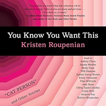
Look at that picture. It says tunnel. In a very specific way. A very specific tunnel. It's super obvious and yet also clever! There are multiple meanings. It makes me think of Alice in Wonderland.

Yes, the cover could have been done in any vector program, but the idea of the cover is what they pay the designers for. I'm sure there were a dozen concepts and pitches.

For me, the visuals were very striking, and had the intended effect. It drew my eye on Audible (thanks to being heavily featured), then I recognized the title of a story I'd heard went viral (though haven't read), recognized Aubrey Plaza's name as one of the narrators, and bought it without further consideration.

But I am their target market. Though I'm a writer, I'm more of a casual reader, and I read women's fiction and sometimes literary, mostly stand-alones. I like short stories. I am not price sensitive, because I value my time more than a few bucks, and I read for pleasure at a rate of maybe 5000 words a day, mostly audio in the car.

So that's a case study of a book finding its way to the ideal reader.

FWIW, I loved the first story. I'm on Cat Person right now and it's so upsetting I had to keep pausing it. LOL. I can see why the story went viral. It's the kind of uncomfortable read that the "for-comfort-only" readers would never want to read, but that appeals to people who enjoy a challenging (as in challenging how you feel about things and people and life, as opposed to big words) read.

There are two kinds of readers. The ones who want to read about good people trying to do good things with good outcomes, and the ones who will read about sh*tty people being sh*tty. It's funny that I will read about sh*tty people, because I don't tolerate them in real life, but I guess that's fiction for ya. I don't read about serial killers, so there's a limited range of sh*ttiness I read about. *

*ETA: There are probably serial killers in this collection that I haven't encountered yet. LOL.
« Last Edit: February 06, 2019, 06:14:48 AM by angelapepper »
 

Crystal

I refer to this as the "Indie Tax", in that self-publishers are expected (okay, urged) to produce amaaaaaaazing covers, but have you seen the cover for "You Know You Want This"? I can, and have, done better with PowerPoint. But they're not paying me the big bucks.

I don't think that's true. Big tradpub authors almost always have amazing covers.

Trad books aren't that different than indie books. The books with eye-catching covers sell best. That doesn't always mean a conventional genre cover, especially when it comes to huge hits. Those books often go with more broad imagery.

The YKYWT cover might not be typically beautiful, but it is eye catching, clever, and descriptive. It's also a $13 book of short stories. It doesn't have the same goals as a thriller or romance cover. It's not appealing to the same audience.
 
The following users thanked this post: angela

Maggie Ann

My eyes can not take in that cover. It's a large black band (nothing wrong with that in itself) against a sickening pink background (I usually like pink). In fact, that cover makes me a little queasy, probably because of the lines that whirl my eyes around like a vortex.


OfficialEthanJ

The YKYWT cover might not be typically beautiful, but it is eye catching, clever, and descriptive.

And how's it grab you at 70 x 115 px?
 

Maggie Ann

The YKYWT cover might not be typically beautiful, but it is eye catching, clever, and descriptive.

And how's it grab you at 70 x 115 px?


Pretty much unreadable. The author's last name is kind of lost.


Crystal

The YKYWT cover might not be typically beautiful, but it is eye catching, clever, and descriptive.

And how's it grab you at 70 x 115 px?


Pretty much unreadable. The author's last name is kind of lost.

Why are we looking at the audio cover? The ebook cover was cleaner. The audio cover is cluttered with all the narrators.

It's not the type of thing I read. I don't read litfic. But it's still clear what the cover is saying at thumbnail. It's hard to miss the hey look, it's a vagina.

(Someone had to spell it out).
 

CoraBuhlert

I do like the covers of Black Leopard, Red Wolf and Bangkok Wakes To Rain, even thought I have zero interest in Black Leopard, Red Wolf (Marlon James seriously rubs me the wrong way) and have no idea what Bangkok Wakes To Rain even is about. The bird on pastel background look of Ginger Bread and Mostly Dead Things does nothing for me (and unless Helen Oyemi has radically changed what she writes, it doesn't fit her fiction). Ditto for the hightech vagina of You Know You Want This, another book I have zero interest in. I tried reading "Cat Person", when it went viral and didn't get why I should care about those people and their bad date.

However, all of these books are geared towards the mainstream casual reader market, even the genre ones. Case in point, the constant positioning of Black Leopard, Red Wolf as the African Game of Thrones, even though there have been several African fantasy and science fiction works in recent years, some of them very successful. But those books were still marketed at the SFF readership rather than at a general readership. N.K. Jemisin had to win three Hugos in a row to get a fracture of the mainstream push Marlon James is getting.

I have one book that has a typographic cover. It's a humorous romance between two anti-war activists set in the early 1980s. The traditional romance cover approach wouldn't have worked (never mind that there is no traditional cover approach for early 1980s counterculture romance), so I went with a typographic cover emulating the look of counterculture flyers, posters and zines from the 1980s (spending way too much time looking at original examples) and came up with this.  It doesn't sell very well, but then it's simply not a to market book in any way. However, Kobo liked the cover enough that they featured the book in one of their promos of their own accord.   

Blog | Pegasus Pulp | Newsletter | Author Central | Twitter | Instagram
Genres: All of them, but mostly science fiction and mystery/crime
 

Maggie Ann

I do like the covers of Black Leopard, Red Wolf and Bangkok Wakes To Rain, even thought I have zero interest in Black Leopard, Red Wolf (Marlon James seriously rubs me the wrong way) and have no idea what Bangkok Wakes To Rain even is about. The bird on pastel background look of Ginger Bread and Mostly Dead Things does nothing for me (and unless Helen Oyemi has radically changed what she writes, it doesn't fit her fiction). Ditto for the hightech vagina of You Know You Want This, another book I have zero interest in. I tried reading "Cat Person", when it went viral and didn't get why I should care about those people and their bad date.

However, all of these books are geared towards the mainstream casual reader market, even the genre ones. Case in point, the constant positioning of Black Leopard, Red Wolf as the African Game of Thrones, even though there have been several African fantasy and science fiction works in recent years, some of them very successful. But those books were still marketed at the SFF readership rather than at a general readership. N.K. Jemisin had to win three Hugos in a row to get a fracture of the mainstream push Marlon James is getting.

I have one book that has a typographic cover. It's a humorous romance between two anti-war activists set in the early 1980s. The traditional romance cover approach wouldn't have worked (never mind that there is no traditional cover approach for early 1980s counterculture romance), so I went with a typographic cover emulating the look of counterculture flyers, posters and zines from the 1980s (spending way too much time looking at original examples) and came up with this.  It doesn't sell very well, but then it's simply not a to market book in any way. However, Kobo liked the cover enough that they featured the book in one of their promos of their own accord.   

And a typographical error if I read it right.  Grin  But I really do like the cover.


Jessica

Maybe it's just me, but neither of those two covers are particularly appealing.  Plus, for all the talk of making titles stand out in thumbnail, the art tends to bury those titles in the thumbnail.  And, on the one, what's with the O in "WOLF" wrapping around the eye?  The teeth and tongue wrapped around letters makes sense, but the O wrapping behind an eye?  Ugh.

The Instagram ad features some animation, starting with a black screen then the eyes open up (each pair after another) and the rest smothly sneaks in. So the eyes are the main part and they shouldn't be covered by the title, I think.

I also like the cover. It feels more like a design piece/ a poster for an indie movie, you know, something you could frame and hang up as a solitary piece above your office desk so you can look at it from time to time while you're busy doing client work (like managing a social media campaign). It fits well with the overall wave of "less is more"/ Marie Kondo/ IKEA/ in remembrance of Steve Jobs style. Well, and honestly, I can't see what's wrong with that.
(But, as I ended up buying Black Leopard the other day: The print quality of the cover is... meh. The fonts are blurred and not that sharp as you would expect.)
Avatar Photo by Allef Vinicius on Unsplash